Textos en inglés al final del post, marcados con [*] en cada párrafo.
Texts in English at the end of this post, marked with [*] in each paragraph.
Edward Hopper
(Nyack, Rockland, Nueva York, EE.UU./ NY, USA, 1882 - 1967)

Edward Hopper c.1953. Foto / Photo: Archives of American Art
Edward Hopper (1882-1967) fue un prominente pintor realista e grabador estadounidense. Aunque su obra más popular consiste en pinturas al óleo, fue también un competente acuarelista y grabador. Tanto en sus escenas urbanas como rurales, su finamente calculada representación refleja su visión personal de la vida estadounidense moderna.
Se le considera uno de los pintores de la escuela Ashcan, que a través de Arshile Gorky llevó al expresionismo abstracto posterior a la Segunda Guerra Mundial. [1]
Texto traducido de la versión en inglés de Wiki.

Edward Hopper (tercero por la izquierda) en una clase de dibujo del natural de Rober Henri en la Escuela de Arte de New York /
Edward Hopper (third from the left) in Robert Henri's Life Drawing Class at the New York School of Art, 1903–04
Frances Mulhall Achilles Library, Whitney Museum of American Art

Izq./ Left: "Desnudo masculino de pie / Standing Male Nude", 1903-04.
Der./ Right: "Desnudo masculino / Male Nude", boceto / sketch, 61 x 24,4 cm., 1903-04.
Brooklyn Museum, Brooklyn (New York, USA)

"Pintor y modelo / Painter and Model", óleo sobre cartón / oil on cardboard, 26 x 20,5 cm., 1902-1904. Whitney Museum of American Art (New York, USA)

Edward Hopper, Paris, 1907. Foto / Photo: MS Fine Art
En 1905, Hopper empezó a trabajar a tiempo parcial en una agencia de publicidad, donde creó diseños para portadas de revistas especializadas. Llegó a detestar la ilustración. Se mantuvo enganchado ella por necesidades económicas hasta mediados de los años '20. Temporalmente se escapó a tres viajes por Europa, centrados en París, obviamente para estudiar la emergente escena artística. De hecho, sin embargo, estudió sólo y parece que no le afectaron mayormente las nuevas tendencias artísticas. Más tarde diría: "no recuerdo haber oido hablar de Picasso en absoluto". Quedó muy impresionado con Rembrandt, en particular con "La ronda nocturna", de la que dijo: "la más maravillosa de sus obras que he visto." [2]
Texto traducido de la versión en inglés de Wiki.

"Le Pont des Arts / El Puente de las Artes / Bridge of Arts"
Óleo sobre lienzo / oil on canvas, 58,6 x 71,3 cm., 1907.
Whitney Museum of American Art (New York, USA)

Edward Hopper haciendo bocetos en París / Sketching in Paris, 1907.
Frances Mulhall Achilles Library, Whitney Museum of American Art. Foto / Photo: Whitney Museum
Hopper comenzó a pintar escenas urbanas y arquitectónicas en una paleta oscura. Luego cambió a la más luminosa de los impresionistas, antes de regresar a la oscura con la cual se sentía más a gusto. Luego diría: "Superé eso y después las cosas que hice en París eran más del tipo de cosas que hago ahora." Hopper pasaba mucho de su tiempo dibujando en las calles y cafés, y yendo al teatro y a la ópera. A diferencia de muchos de sus contemporáneos que imitaban los experimentos cubistas abastractos, Hopper se sentía atraído por el arte realista. Más tarde admitió que no tenía más influencias europeas que los grabados de Charles Méryon, cuyas temperamentales escenas parisinas imitaba. [3]
Texto traducido de la versión en inglés de Wiki.

"Aprés midi de juin / Tarde de junio / June Afternoon", óleo sobre lienzo / oil on canvas, 59,7 x 72,4 cm. 1907.
The Whitney Museum of American Art (New York. USA)

Pintando / Painting "El faro de la colina / Lighthouse Hill", 1927. Foto / Photo: Whitney Museum
A pesar del brillante cielo azul y tema aparentemente sereno, el tratamiento de las sombras de Hopper hace de la pintura algo inquietante e incómodo. La fachada en sombras de la cabaña que enfrenta al espectador con sus ventanas negras, es muy poco atractiva. Además, las sombras se deslizan hacia afuera hacia el espectador a través de la colina ondulada. Parece como si la casa hubiera extendido su tristeza a través de la pintura hacia el espectador. La perspectiva se suma a la inquietud de la pintura, la casa se cierne por encima del espectador dominándolo. [4]
Texto traducido de aquí.

"El faro de la colina / Lighthouse Hill", óleo sobre lienzo / oil on canvas, 71,76 x 100,33 cm., 1927.
Dallas Museum of Fine Arts, Dallas (Texas, USA)
Las dos estructuras arquitectónicas, el faro y la cabaña, son claramente los puntos focales de la pintura. Presentan detalles meticulosos, bordes limpios y brillantes destaques blancos. En contraste, el paisaje está hecho sólo con unas pocas sombras alargadas y faltas de detalle, que además han sido pintadas en un estilo más duro, con lo cual las pinceladas aún son visibles y han sido representadas con colores más negros y sutiles. La cabaña inmediatamente atrapa la atención del espectador, porque Hopper la coloca directamente en el centro de la pintura. Además de hacer de la cabaña el centro de la pintura, las decisiones compositivas de Hopper añaden un poco de inquietud a la pintura. La cabaña y el faro situado a su derecha, parecen abandonar la pintura por ese lado. La composición añade nervio al lado derecho, dejando un espacio inquietante hacia el izquierdo. En resumen, la pintura de Hopper utiliza un sujeto de ordinario pacífico, para retratar un estado de ánimo inquieto, utilizando técnicas de composición, color y perspectiva. [5]
Texto traducido de aquí.

Edward Hopper fotografiado por / photographed by Arnold Newman, 1941. Foto / Photo: aaaaarte

Edward Hopper, 1947. Foto / Photo: Berenice Abbott, de / from: manemonic79
"Dibujo para Sol en una habitación vacía / Drawing for Sun in an Empty Room"
Carboncillo sobre papel beige / charcoal on beige paper, 31 x 37,8 cm., 1963.
Musée Cantini (Marsella, Francia)
"Sol en una habitación vacía" (...) ejemplifica el interés de Hopper en vaciar de cosas los espacios. A menudo, cuando comparas los trabajos preparatorios para las pinturas con las propias pinturas, ves este proceso. Lo ves poniendo cosas en los dibujos que al final termina quitando en las pinturas. Si miras "Sol en una habitación vacía" en relación a sus trabajos anteriores de habitaciones, ves cómo funciona este proceso. Está vaciando la habitación. Quita todo de la habitación exceptuando, quizá, al espectador. Este se ve implicado, y al final termina pintando la luz del sol a un lado de la casa, que es algo que él dijo que quería hacer.
En esta obra reduce las cosas a su esencia, y carga en el espectador la responsabilidad de llegar al significado, ya que no hay una figura con la cual interactuar. Pero al hacer eso, creo que llega a este punto de vista destilado con el cual ha logrado mucho de lo que quería con este arte. [6]
Comentario de Carter Foster en la audioguía del Whitney Museum of American Art, que puede escucharse (en inglés) aquí.
Edward Hopper y Jo pintando en / painting in 1963. Foto / Photo: Encuentros con el arte
"Sol en una habitación vacía / Sun in an Empty Room"
Óleo sobre lienzo / oil on canvas, 28 3/4"x 39 1/2", 1963. Colección privada / Private collection.
_____________________________________________________
Hopper en su taller / Hopper at his Studio
____________________________________________________

El estudio de Hopper en / Hopper's Studio at One Washington Square North. Foto / Photo: Off the Grid

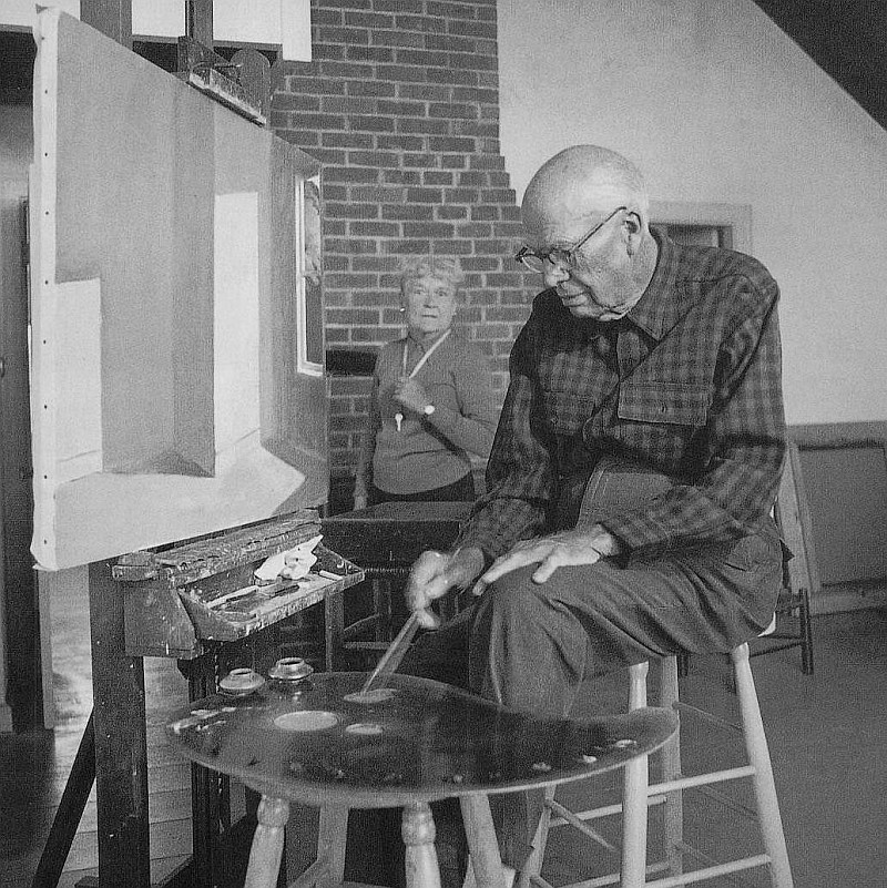
Hopper pintando con Raphael Soyer / Hopper painting with Raphael Soyer.
Foto / Photo: Reginald Marsh, de / from "Vine, vi y pinté"
Berenice Abbott en "El Hurgador" / in this blog: [Aniversarios (XXV)], [Aniversarios Fotografía (LXXIII)]
Raphael Zalman Soyer
(Борисогле́бск / Borisoglebsk, Gobernación de Tambov
[hoy en el Óblast de Voronezh], Imperio ruso /
Tambov Governorate [now in Voronezh Oblast], Russian Empire, 1899 -
Nueva York, EE.UU./ NYC, USA, 1987)

"Autorretrato en el 2º año de la Guerra / Self Portrait in the 2nd Year of War"
Óleo sobre lienzo / oil on canvas, 38 x 25,5 cm., 1941
Raphael Soyer (1899-1987) fue un pintor, dibujante y grabador estadounidense de origen ruso. Se le encuadra dentro del Realismo Social debido a su interés en los hombres y mujeres en ambientes contemporáneos (calles, subterráneos, salones y estudios de artistas) de la ciudad de New York. También escribió varios libros sobre su vida y el arte. [7]

Pintando a / Painting "Cynthia", 1971. Foto / Photo: Archives of American Art.

"Cynthia", óleo sobre lienzo / oil on canvas, 162.6 x 132 cm., 1971

Soyer pintando a / Soyer painting Saul Bellow. Foto / Photo: Archives of American Art.

Soyer con Jose de Creeft and Lorrie Goulet y su obra / Soyer with Jose de Creeft and Lorrie Goulet and his work.
Foto / Photo: Archives of American Art.

"Jose de Creeft and Lorrie Goulet", óleo sobre lienzo / oil on canvas, 76 x 76 cm.
Colección privada / Private Collection
,+photographer-blg.jpg)
En su estudio / At his studio, ca. 1940. Foto / Photo: Alfredo Valente, Archives of American Art
Raphael desarrolló su educación artística en las escuelas libres de la Cooper Union, donde conoció a Chaim Gross, quien se convirtió en un amigo de toda la vida a partir de ese momento. Continuó sus estudios en la Academia Nacional de Diseño y, posteriormente, en la Liga de Estudiantes de Arte de Nueva York. Mientras estuvo allí, estudió con Guy Pene du Bois y Boardman Robinson, tomando los ásperos temas urbanos de la escuela de Ashcan. Cuando terminó su educación formal, Soyer se asoció con la Fourteenth Street School (Escuela de la calle Catorce) de pintores que incluía a Reginald Marsh, Isabel Bishop, Kenneth Hayes Miller, Peggy Bacon y a su maestro Guy Pene du Bois. Soyer persistentemente investigó en sus pinturas, dibujos, acuarelas y grabados una serie de temas: desnudos femeninos, retratos de amigos y familiares, Nueva York y, sobre todo, su gente. Él se mantuvo firme en su creencia en el arte figurativo y se opuso firmemente a la fuerza dominante del arte abstracto durante finales de los '40 y principios de los '50. En defensa de su posición declaró: "Elijo ser realista y humanista en el arte." Fue un artista de la Gran Depresión. [8]
Texto traducido de la versión en inglés de Wiki.

Pintando una escena de la película "The Long Voyage Home / Hombres intrépidos" (John Ford, 1940)

Cartel promocional para "The Long Voyage Home" pintado por Soyer
Promo poster for "The Long Voyage Home" painted by Soyer

Pintando / Painting "Avenida de las Américas / Avenue of the Americas", 1969
Foto / Photo: Archives of American Art

"Avenida de las Américas / Avenue of the Americas" en Galería Forum, New York
Óleo sobre lienzo / oil on canvas, 127 x 203,2 cm., 1969. Foto / Photo: Artnet

Pintando en su estudio / Painting at his Studio, ca. 1950.
Foto / Photo: Alfred Puhn, Archives of American Art
.jpg)
"Sin título (Retrato de una mujer fumando) / Untitled (Portrait of a woman smoking)
Óleo sobre lienzo / oil on canvas, 12 1/2" x 16 1/4".

Pintando en su estudio / Painting in his Studio, ca. 1950. Foto / Photo: Alfred Puhn
.+Whitney+Museum+of+American+Art,+New+York.jpg)
"Oficinistas / Office Girls", óleo sobre lienzo / oil on canvas, 66 x 61 cm., 1936
Whitney Museum of American Art (New York, USA)

Trabajando en su estudio / Working at his Studio. Foto / Photo: Archives of American Art.


"Autorretrato / Self Portrait", óleo sobre lienzo / oil on canvas, 61 x 50,8 cm., 1980.
Museo Thyssen-Bornemisza (Madrid, España)
Raphael Soyer se interesó durante toda su vida por el género del retrato. Su familia y sus amigos del mundo artístico neoyorquino aparecieron en sus obras, a veces en solitario y otras en grupo. Él mismo se convirtió en el protagonista en sus más de cincuenta autorretratos.
De la ficha de la obra en la web del museo Thyssen-Bornemisza
Raphael Soyer had a lifelong interest in the genre of portraiture. He painted his family and friends of the New York art scene, sometimes singly and sometimes in groups. He himself was the subject of many paintings and there are more than fifty surviving self-portraits.
From the record about this artwork in the website of Thyssen-Bornemisza Museum
Texto en inglés / English Translation
[1]
Edward Hopper (July 22, 1882 – May 15, 1967) was a prominent American realist painter and printmaker. While he was most popularly known for his oil paintings, he was equally proficient as a watercolorist and printmaker in etching. Both in his urban and rural scenes, his spare and finely calculated renderings reflected his personal vision of modern American life.
He is considered one of the painters of the Ashcan school which through Arshile Gorky led to the abstract expressionism after the Second World War. Text from Wiki.
[2]
In 1905, Hopper landed a part-time job with an advertising agency, where he created cover designs for trade magazines. Hopper came to detest illustration. He was bound to it by economic necessity until the mid-1920s. He temporarily escaped by making three trips to Europe, each centered in Paris, ostensibly to study the emerging art scene there. In fact, however, he studied alone and seemed mostly unaffected by the new currents in art. Later he said that he “didn’t remember having heard of Picasso at all.” He was highly impressed by Rembrandt, particularly his Night Watch, which he said was “the most wonderful thing of his I have seen.” Text from Wiki.
[3]
Hopper began painting urban and architectural scenes in a dark palette. Then he shifted to the lighter palette of the Impressionists before returning to the darker palette with which he was comfortable. Hopper later said, "I got over that and later things done in Paris were more the kind of things I do now.” Hopper spent much of his time drawing street and café scenes, and going to the theater and opera. Unlike many of his contemporaries who imitated the abstract cubist experiments, Hopper was attracted to realist art. Later, he admitted to no European influences other than French engraver Charles Méryon, whose moody Paris scenes Hopper imitated. Text from Wiki.
[4]
Despite Hopper's bright blue sky and seemingly serene subject, Hopper's treatment of shadows made the painting somewhat disturbing and uneasy. The shadowy facade of the cottage that faces the viewer with its black windows are quite uninviting. In addition, shadows creep outward towards the viewer across the rolling hill. It seems as if the house hs spread its gloom across the painting toward the viewer. Theperspective adds to the uneasiness of the painting; the house looms high above the viewer, thereby dominating the viewer.
Text from here.
[5]
The two architectural structures, the Lighthouse and Cottage, are clearly the focal points of painting. They contain meticulous detail, clean edges and bright white highlights. In contrast, the landscape is made of only a few large shapes and therefore lacks detail, it was also painted in a rougher style so that the brush strokes are still visible, and it was rendered with more subtle and darker colors. The Cottage immediately grabs the viewer's attention because Hopper placed it directly in the center of the painting. In addition to making the Cottage the centerpiece of the painting, Hopper's compositional decision adds a bit of unease to the painting. The Cottage and the Lighthouse, located right of the Cottage, seem to be leaving the painting to the right. The composition adds stress to the right side while leaving a disturbing gap to the left. In Summary, Hopper's painting uses an
ordinarily peaceful subject to portray an uneasy mood through techniques of composition, color, and perspective.
Text from here.
[6]
Sun in an Empty Room, (...) exemplifies Hopper’s interest in emptying things out. Oftentimes when you study Hopper’s preparatory studies for a painting with the painting itself, you see this process. You see him putting things in the drawings that he ends up taking out in the paintings. If you look at Sun in an Empty Room against all of his previous bedroom pictures, you see this process working itself out. He’s emptying out the room. He takes everything out of the room, except for perhaps the viewer. The viewer is implicated and he ends up painting sunlight on the side of a house, which is something he stated he wanted to do.
He reduces things down to their essences in this work, and it puts more onus on the viewer to come up with what the meaning is, because you don’t have a figure to bounce off of. But in doing so, I think he comes to this distilled point where he was doing a lot of what he wanted to do in his art.
Comments by Carter Foster in the audioguide of the Whitney Museum of American Art, you can hear here.
[7]
Raphael Soyer (December 25, 1899 – November 4, 1987) was a Russian-born American painter, draftsman, and printmaker. Soyer was referred to as an American scene painter. He is identified as a Social Realist because of his interest in men and women viewed in contemporary settings which included the streets, subways, salons and artists' studios of New York City. He also wrote several books on his life and art.
Text from Wiki.
[8]
Raphael pursued his art education at the free schools of the Cooper Union where he met Chaim Gross, who became a lifelong friend from that time. He continued his studies at the National Academy of Design and, subsequently, at the Art Students League of New York. While there, he studied with Guy Pene du Bois and Boardman Robinson, taking up the gritty urban subjects of the Ashcan school. After his formal education ended, Soyer became associated with the Fourteenth Street School of painters that included Reginald Marsh, Isabel Bishop, Kenneth Hayes Miller, Peggy Bacon and, his teacher, Guy Pene du Bois. Soyer persistently investigated a number of themes—female nudes, portraits of friends and family, New York and, especially, its people—in his paintings, drawings, watercolors and prints. He was adamant in his belief in representational art and strongly opposed the dominant force of abstract art during late 1940s and early 1950s. Defending his position, he stated: "I choose to be a realist and a humanist in art." He was an artist of the Great Depression.
Text from Wiki.


